
Spark: Research-backed concept creation

Evolving an AI concept generator into a guided, trustworthy workflow that helps innovation teams move from prompt → research context → concepts → transparent scoring.
ROLE
PROBLEM
Spark promised speed and creativity, but the workflow broke down when users couldn’t trust the inputs, understand what shaped the outputs, or make confident decisions, especially in enterprise contexts where brand governance and scoring credibility mattered.
OUTCOME
• Redesigned the concepting workflow to reduce starting-state ambiguity and improve the quality of inputs before generation.
• Introduced enterprise-safe brand configuration and permissions, balancing governance with everyday exploration.
• Spark now supports 500+ monthly active users generating thousands of concept searches across enterprise innovation teams.
Overview
Spark is an AI-powered concept creation tool that uses a conversational interface to generate early stage product concepts grounded in Mintel’s proprietary data and content.
As the product matured, the product challenge shifted from "generate concepts" to "help users make confident decisions"; guiding them into the right context (market/category/innovation stage/brand), structuring research so it’s skimmable and useful, and making scoring understandable rather than mysterious.
This case study focuses on how I used product judgement (progressive disclosure, governance, and transparency) alongside close cross-functional collaboration to reduce ambiguity and cognitive load in a complex, data-driven workflow.
The problem
Spark’s core promise is speed and creativity, but concept creation breaks down if users can’t trust the inputs, understand what shaped the outputs, or reliably steer the system.
The main product problems we tackled were:
Starting-state ambiguity: Users needed a clearer “how do I begin?” moment and a faster way to re enter the tool with relevant prompts (especially for returning users).
Context and precision: For high quality outputs, Spark needed structured context up front (e.g. category, market, innovation stage, brand), but without making the workflow feel heavy or brittle.
Research being skipped: Earlier prompt flows were being clicked through without meaningful engagement, which led to generic concepts. The workflow needed to encourage research grounded ideation without forcing a long “UX ceremony”.
Trust and explainability: When scoring is introduced, the experience has to do more than show a label, it must help users understand why something scored as it did (and what to change), or the scoring becomes noise.
Governance in enterprise contexts: Brand inputs are high stakes. We needed a permissions model that prevents accidental edits and supports organisational governance, without blocking everyday usage for non admin users.
My role & collaboration
I led product design across Spark’s end-to-end concepting workflow; shaping the user journey, defining key interaction patterns, and working iteratively with product and engineering as scope evolved. I balanced user needs with delivery constraints (e.g. single-select filters, phased releases, performance limits).
How collaboration shaped outcomes:
With the Product Manager, I shaped the end-to-end workflow and the rationale behind key product decisions (e.g. prompts, filter confirmation, brand configuration, and research restructuring).
With engineering partners, we pressure-tested product decisions against feasibility and reliability (e.g. timeouts, retries, translation readiness, and how scoring would behave under load).
With data stakeholders, we aligned the scoring experience with what users should see (and not see), including how granular data should support, rather than undermine, the top level score narrative.
With platform/architecture, we ensured the product model (especially brand configuration and scoring transparency) was consistent with privacy and integration constraints.
Key design decisions
I kept principles intentionally tight. These acted as a decision filter when trade offs appeared:
Clarity over density: Prefer structured experiences that reduce cognitive load, especially where data is complex or unfamiliar.
Progressive disclosure: Put heavy detail (research depth, attribute level scoring) behind deliberate interaction, so the default experience stays approachable.
Governance without friction: Make enterprise controls (admin editing, brand protection) explicit, but don’t punish non admin users who simply want to generate concepts.
Trust through transparency: If we show a score, we also show the reasoning structure and the levers users can pull to improve outcomes.
Redesign the landing experience around momentum and re entry
Problem:
Users needed a clearer entry point and a faster way back into relevant exploration, without starting from a blank prompt every time.
Approach:
Defined a landing experience with smarter prompts; dynamically generated from conversation history for returning users, and curated defaults for first-time users.
Established the landing page as a stable home for Brand Configuration, so high-impact setup isn't buried mid-conversation.
Why it mattered:
It reduced blank page paralysis, supports returning users, and creates a predictable place for high impact configuration.
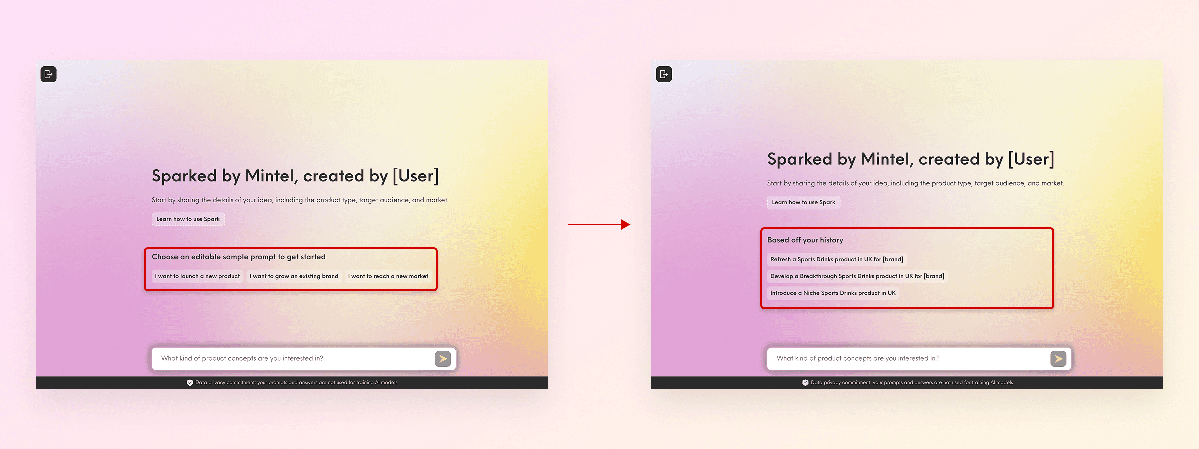
First time usage (left) vs returning usage (right)
Make Brand Configuration enterprise safe
Problem:
Brand inputs need careful management because they can be accidentally edited, set up inconsistently, or made visible to the wrong users.
Approach:
Defined Brand Configuration as a first-class product capability; allowing users to add, edit, and manage brands, with logo support to influence concept imagery.
Shaped a permissions model where clients can choose between open editing and admin-only editing, supporting governance for large organisations while preserving flexibility for smaller teams.
Kept brand selection optional in the concepting workflow, so the tool still supports unbranded exploration.
Why it mattered:
This balances two competing enterprise needs; brand safety and creative iteration speed. Admin only editing reduces the chance of “brand drift” and accidental overwrites, while optional selection avoids blocking ideation when brand setup isn’t ready (a real concern raised in training feedback).
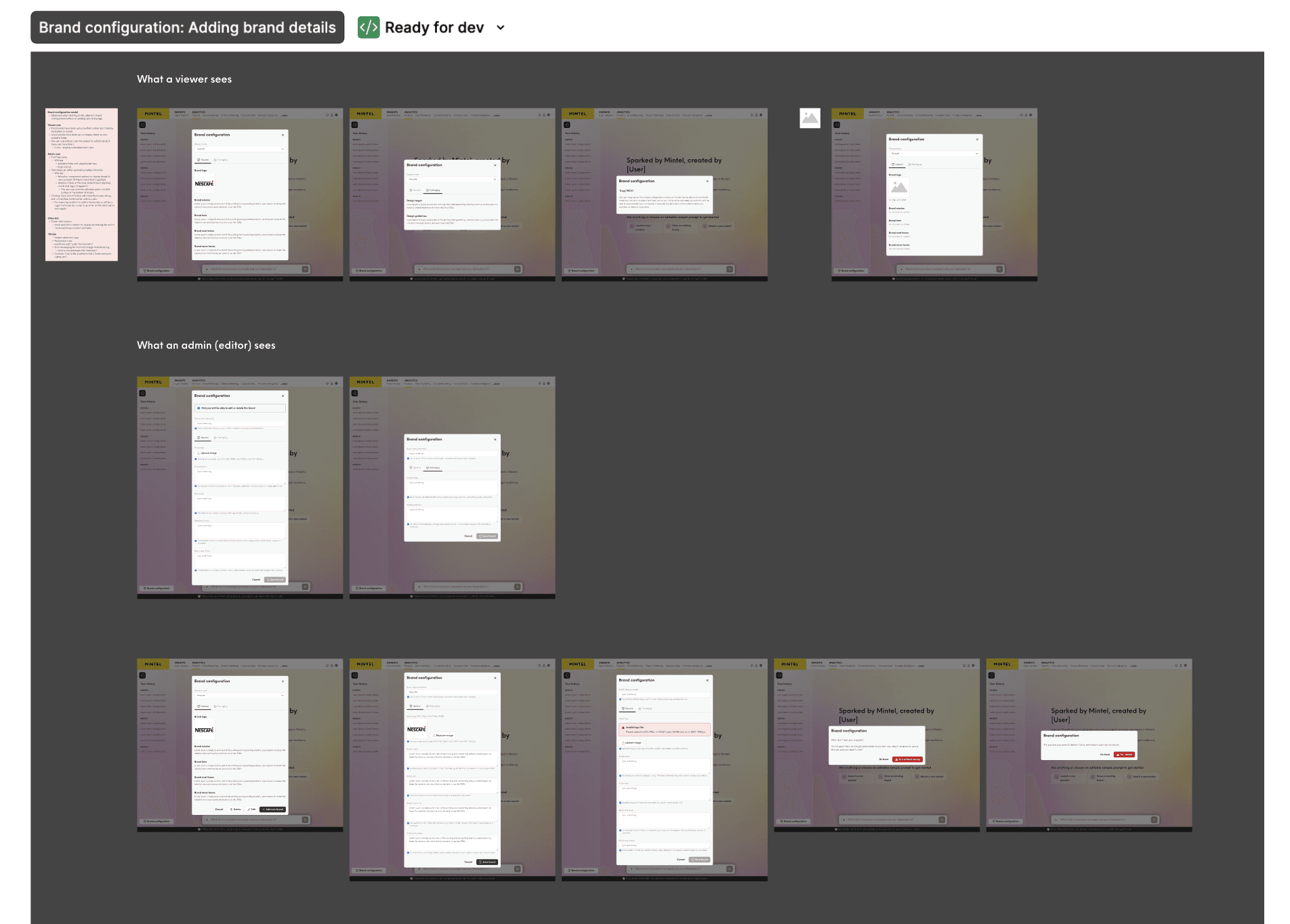
Various viewer vs admin user flows to consider
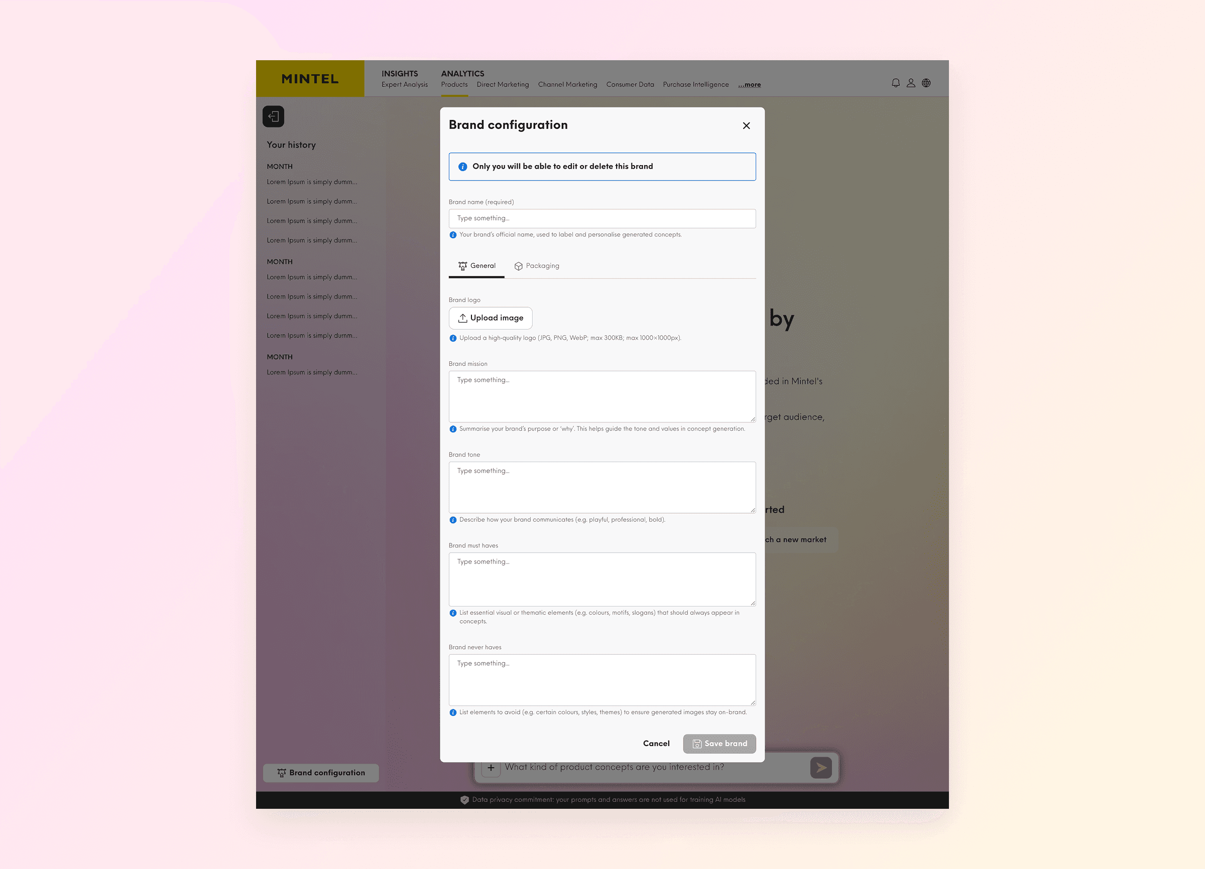
Brand configuration form for admins on first usage
Force filter confirmation up front to protect relevance and the conversation
Problem:
In a conversational UI, it’s easy for context to drift. If market/category/stage aren’t stable, outputs become inconsistent and users can’t tell what changed.
Approach:
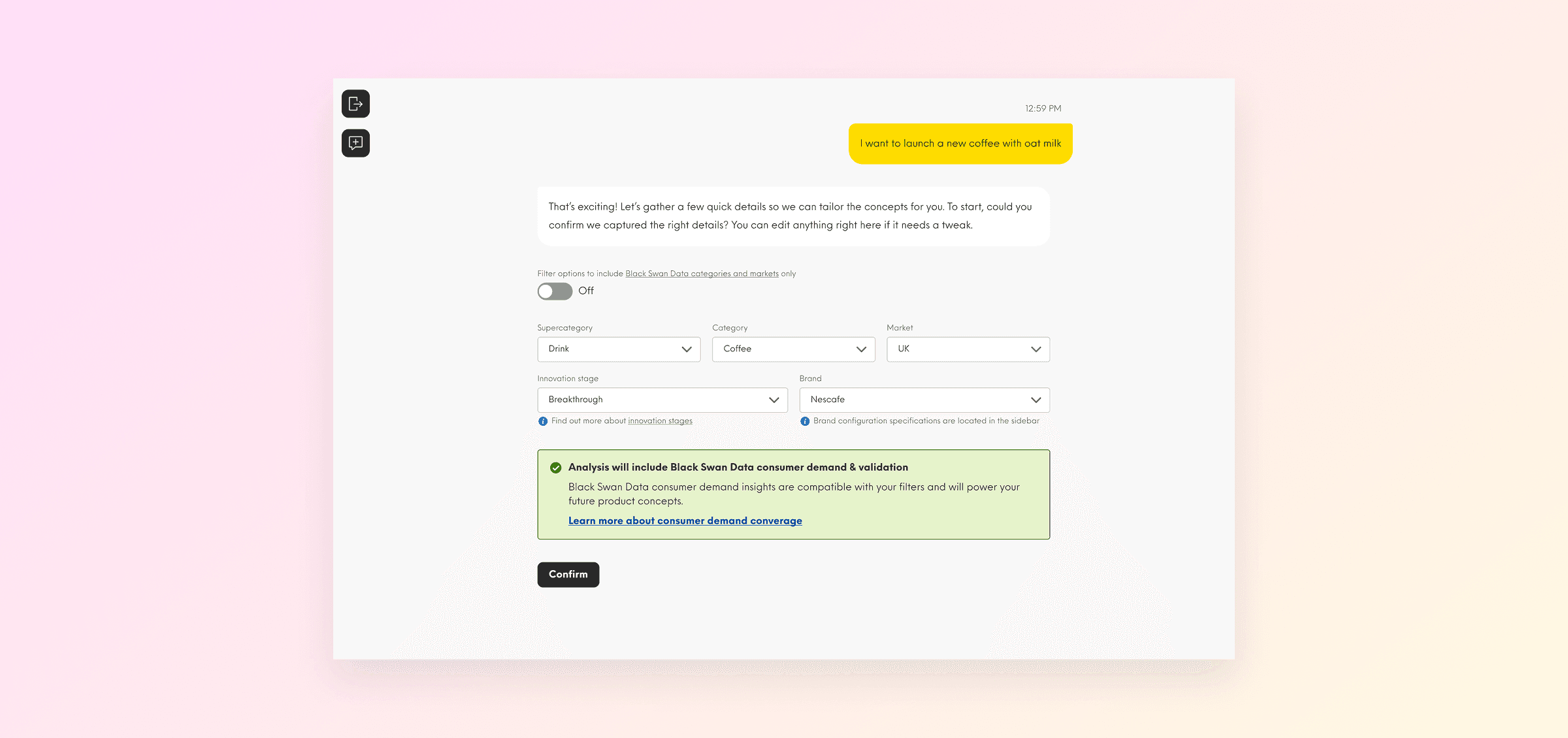
Introduced an explicit filter confirmation step at the start of each conversation, capturing Super-category, Category, Market, Innovation Stage (where applicable), and optional Brand selection.
Defined single-select category and market as a product clarity choice, aligned with technical constraints.
Introduced help content for innovation stages so users understand what they’re choosing.
Added a toggle to show only Black Swan supported filters (external data source), preventing users from selecting contexts that won’t return the expected analysis.
Made “start a new conversation to change direction” an explicit workflow rule, keeping each thread coherent.
Why it mattered:
We accept a small amount of upfront structure in exchange for much higher relevance, better explainability (“this score was for this context”), and fewer “why did the tool do that?” moments. It’s also a guardrail against conversational drift, which is a common failure mode in chat based products.
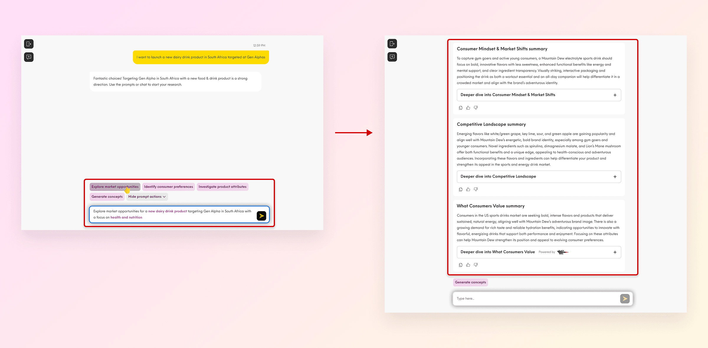
Replace the old quick prompt research flow with auto generated structured research
Problem:
Testing showed users were clicking through prompts without engaging in meaningful research, then generating concepts with shallow context.
Approach:
Replaced the prior quick-prompt sequence with auto-generated structured research immediately after filters are confirmed.
Defined research sections that are scannable and role appropriate.
Ensured research adjusts to chosen brand and innovation stage, so concepts inherit the right strategic frame.
Preserved flexibility: users can ask follow ups within research or move straight to “Generate Concepts”.
Why it mattered:
The workflow stops assuming users want to manually complete research steps and instead provides the right context by default, while still letting motivated users go deeper. It respects expert users’ time while improving concept quality for everyone.
The restructured workflow supports 3,800–6,500 concept searches per month, with ~81% week-one retention. This suggested users return once context is established, rather than abandoning after a shallow first visit.
Making scores understandable, actionable, and defensible
Problem:
Scores are only valuable if users can interpret them and act on them. We also saw internal concern about mismatches between tables, roll up scores, and explanatory text; a trust risk.
Approach:
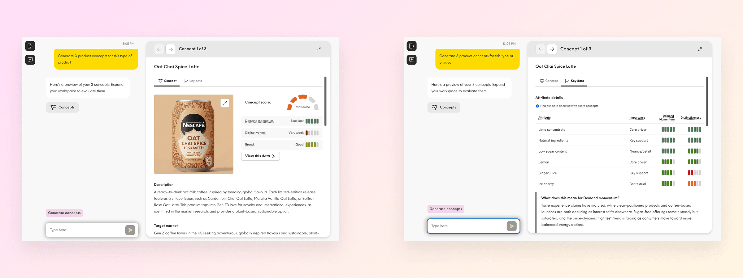
Defined an integrated scoring model within the concept view, with an overall rating built from three metrics; Demand Momentum, Distinctiveness, Brand Fit.
Introduced a Key Data view to provide transparent, granular support for the score: short metric explanations plus attribute level scores, roles (hero/supporting), and importance weighting.
Improved concept review for stakeholder sharing by enabling full-screen concept imagery.
Why it mattered:
This uses progressive disclosure to keep the primary concept experience fast and legible, while offering auditability for users who need to defend decisions. It also reduces the risk that scoring becomes a black box, especially important when Spark is positioned as evidence based and grounded in proprietary data.
Where it landed
Taken together, this work made Spark more trustworthy and more usable at enterprise scale.
The redesigned workflow supports 500–590 unique users each month, generating 3,800–6,500 concept searches across innovation teams. ~81% week-one retention suggests users return once they’ve established context; a sign the upfront structure (filter confirmation, auto-generated research) is helping rather than hindering.
Brand configuration and scoring transparency gave enterprise teams clearer guardrails and more defensible decisions. Nearly 4,000 unique users have engaged with Spark since launch, validating the shift from “generate concepts” to “help users make confident decisions.”
Learnings
Transparency is a feature, not an explanation. Once scoring exists, users don’t just want a result, they want a defensible narrative and levers for iteration. The Key Data tab is a deliberate product investment in trust and usability, not "extra detail".
Enterprise governance must be designed, not bolted on. Brand configuration highlighted a recurring pattern in complex B2B products: you need to support both “safe defaults” (admin control) and “low friction exploration” (optional brand selection), or adoption stalls in real organisations.
Reliability UX is trust UX. Timeouts, retries, and consistent failure states aren’t edge cases — they’re trust building moments. Designing graceful recovery protects confidence in the system over time.