
Leap: AI research assistant

Making source-backed AI answers clear, verifiable, and scalable as the product expanded into richer outputs; charts, audio, and exports.
ROLE
PROBLEM
Users wanted fast AI answers, but also needed to verify sources and reuse outputs in real work. As Leap grew more capable, the product faced a core tension: speed vs. trust, and the experience needed to scale without becoming harder to scan or harder to believe.
OUTCOME
• Defined a product framework for long-form AI answers that balanced speed, scannability, and source transparency.
• Helped establish reusable patterns for richer outputs (charts, audio, exports) that supported user workflows without increasing cognitive load.
• Shifted Leap from a simple answer surface into a connected research experience used by 13,000 unique client users each month.
Overview
Leap is a conversational AI assistant that helps users ask questions and receive answers grounded in Mintel sources. Behind the scenes it uses a conversational Retrieval Augmented Generation (RAG) pattern, questions are translated/rephrased, relevant context is retrieved, and an answer is generated with references, with conversation history stored so users can continue later.
This work demonstrates my ability to bring clarity to complex, data‑driven products: shaping a scannable answer experience, making evidence easy to verify, and evolving the product to support richer outputs (charts/infographics, audio playback and exports) without turning the interface into a cluttered dashboard.
Product judgement mattered because Leap sits on a constant tension: users want fast answers, but also need to trust what they’re reading and trace it back to evidence, especially as answers become longer and more feature‑rich.
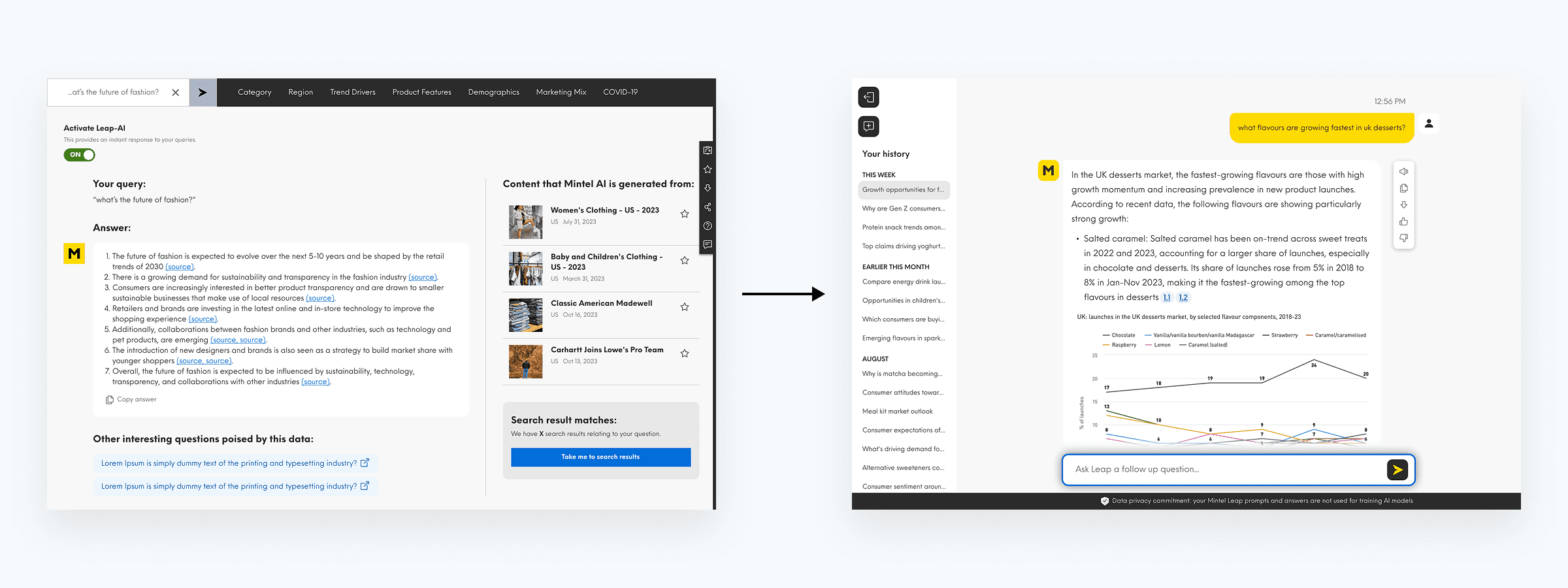
Before/after: The earlier answer experience pilot feature vs the updated, more structured layout.
The problem
Users needed quick answers but also needed to verify sources and reuse outputs in their work (docs, decks, stakeholder comms).
The experience broke down because:
As Leap expanded, answers became longer and harder to scan, increasing cognitive load and making follow‑ups less focused.
Trust depended on transparent sourcing: citations had to feel credible and usable, not just present.
The product needed to support richer content (charts, infographics) and new formats (audio) without breaking the core reading workflow.
The experience had to work across contexts and devices, remain accessible (keyboard/screen readers), and scale through repeatable product patterns, not one‑off solutions.
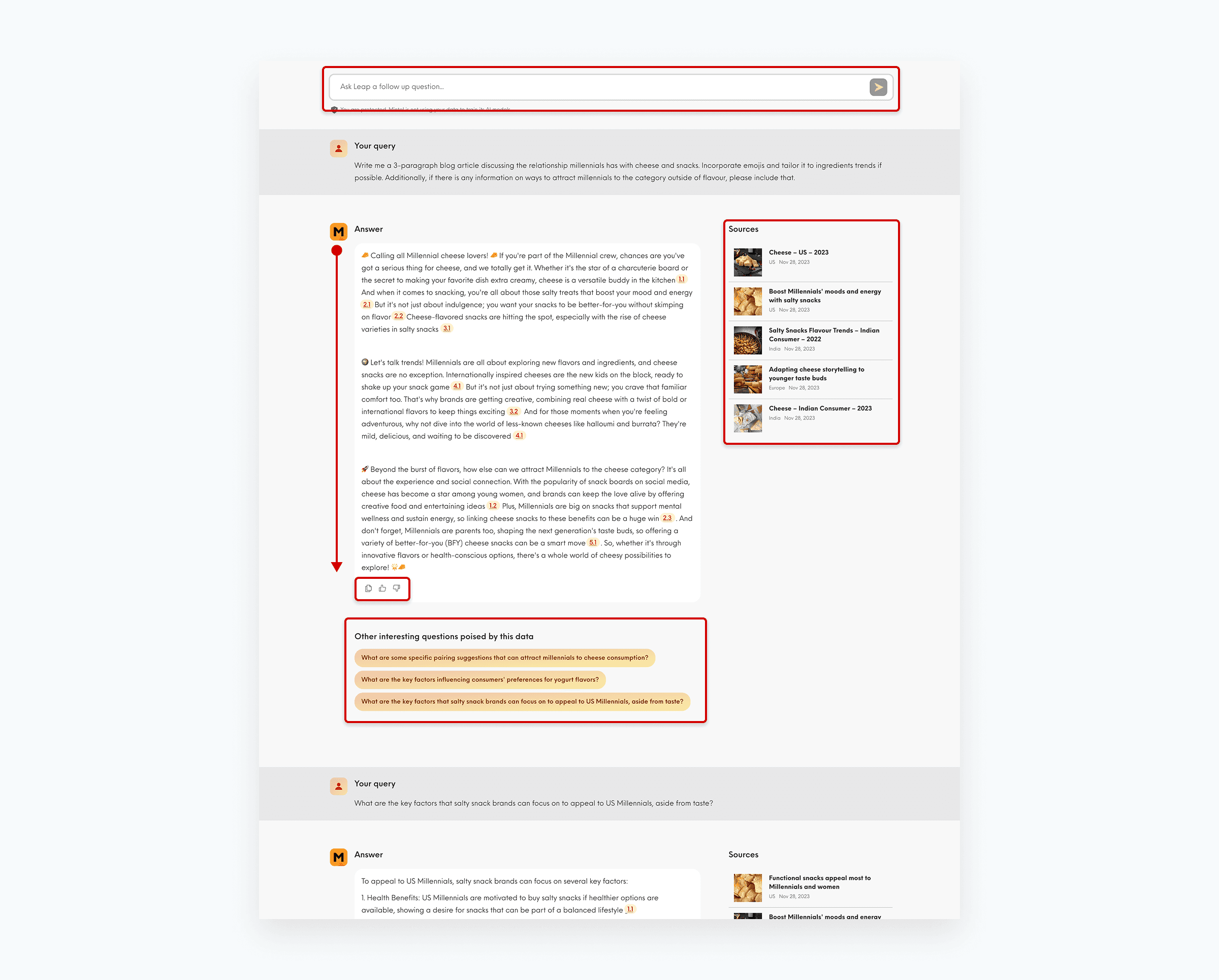
Another old layout: As Leap scaled, answers became longer and more detailed. Without clear structure, key insights and actions were hard to locate, forcing users to read linearly and increasing cognitive load.
My role & collaboration
I owned:
Product design for the answer experience and end-to-end research workflow (reading, verifying, acting).
The answer model and information hierarchy; balancing primary content, supporting evidence, and user actions.
Design direction and implementation guidance to help engineering ship scalable product patterns.
Communication patterns for rollouts and beta experiences, so users understand when something is new or in test.
I partnered with:
Product managers to define scope, priorities, and success criteria around onboarding, response quality, and adoption.
Engineering to pressure-test product decisions early and iterate based on technical and delivery constraints.
Design peers to keep patterns consistent, accessible, and aligned with broader product and design system standards.
How we worked:
Iterative, cross-functional collaboration rather than a single handoff; with lightweight reviews, rapid prototyping, and continuous refinement as the product evolved.
Design decisions
As Leap grew in complexity, I focused on keeping the experience clear, predictable, and easy to scale.
Make the first-time experience self-serve with prompt guidance and personalised onboarding
What I defined:
Many users weren’t especially AI or LLM-savvy yet. For first-time visitors, the challenge wasn’t the interface; it was knowing how to begin, what to ask, or what a good prompt looked like. Returning users needed a faster path back into their workflow.
I shaped the homepage around these two modes: lightweight prompt guidance for new users, and usage-informed suggestions for returning users.
The impact:
This turned prompt guidance into a genuine onboarding mechanism, not decorative UI. New users got a clearer entry point; returning users got a homepage that reflected how they already worked.
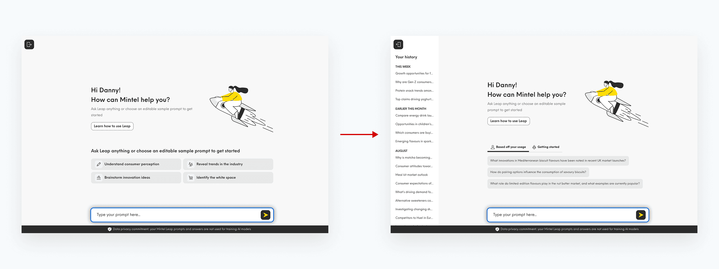
Homepage prompt guidance, first time visiting vs. returning user experience
Make long form answers scannable without losing depth
What we were solving:
Users want comprehensive, insight-rich answers, but LLM responses typically appear as long, unstructured blocks of text. Because the model generates content sequentially, it doesn’t provide reliable hierarchy or prioritisation, making it difficult to quickly extract key takeaways or navigate the response.
What I defined:
I introduced a structured answer framework that layers information using progressive disclosure:
Collapsible sections break responses into manageable chunks
Consistent hierarchy makes answers predictable to scan
Persistent side rail keeps actions accessible without disrupting reading
Follow-up prompts support continued exploration
Structure is handled at the product level, while content remains model-generated, ensuring consistency as responses scale.
Why this was the right call:
This approach makes long-form answers easier to navigate while preserving depth. Users can quickly identify key insights, dive deeper where needed, and continue the conversation without losing context.
By separating structure from content, the system remains flexible to different query types while maintaining a consistent and predictable user experience.
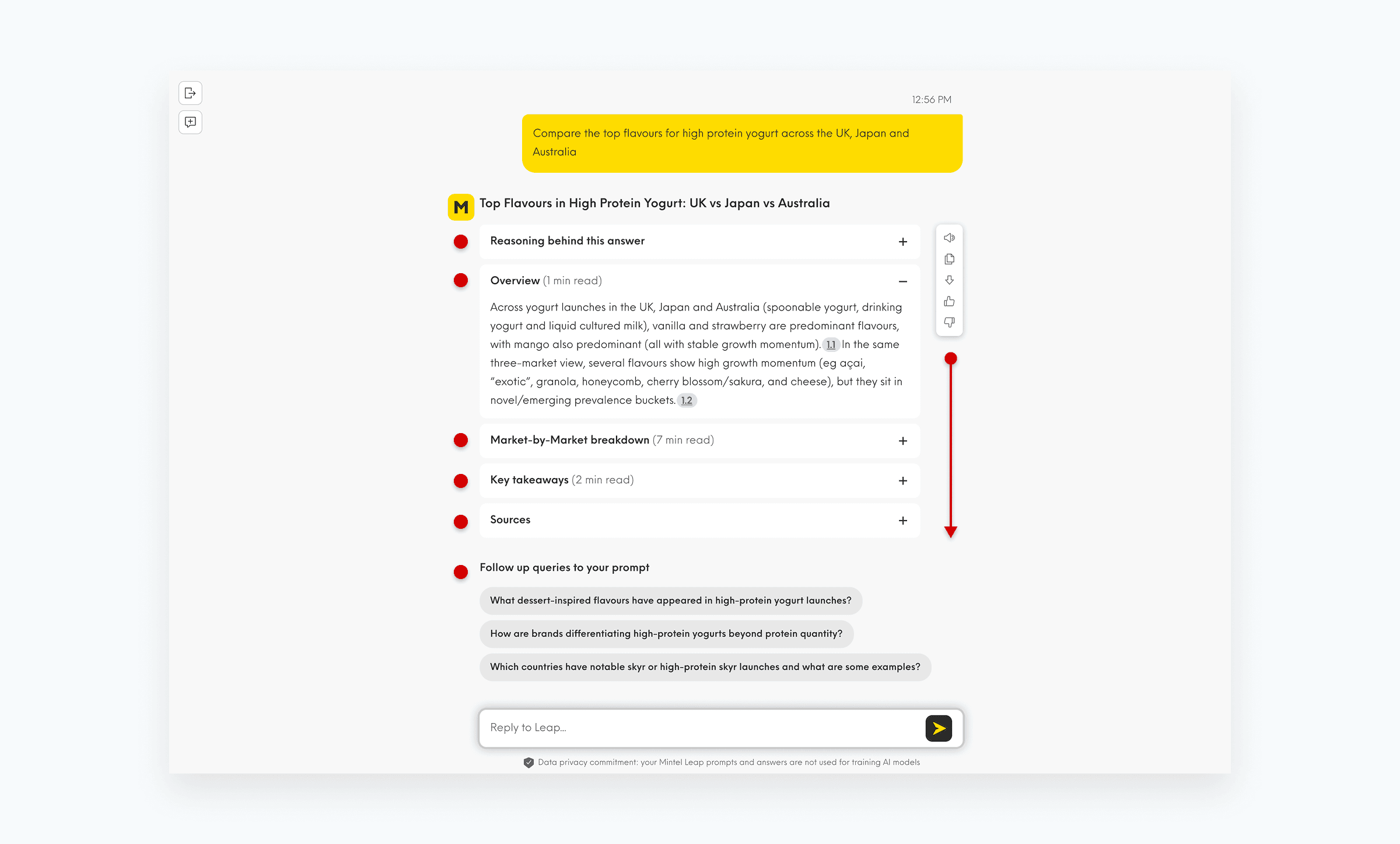
Section hierarchy and persistent action rail (scrolling)
Bring charts into answers without breaking the conversational workflow
What we were solving:
Users need evidence and data context, but embedding visuals can easily overwhelm a conversational reading flow.
What I defined:
Inline charts / infographics that appear when referenced, with interaction where appropriate, maintaining the written answer as the primary narrative.
Implementation notes:
Defined patterns that respected real constraints (e.g. early limitations with copy & paste not including charts) and support progressive enhancement.
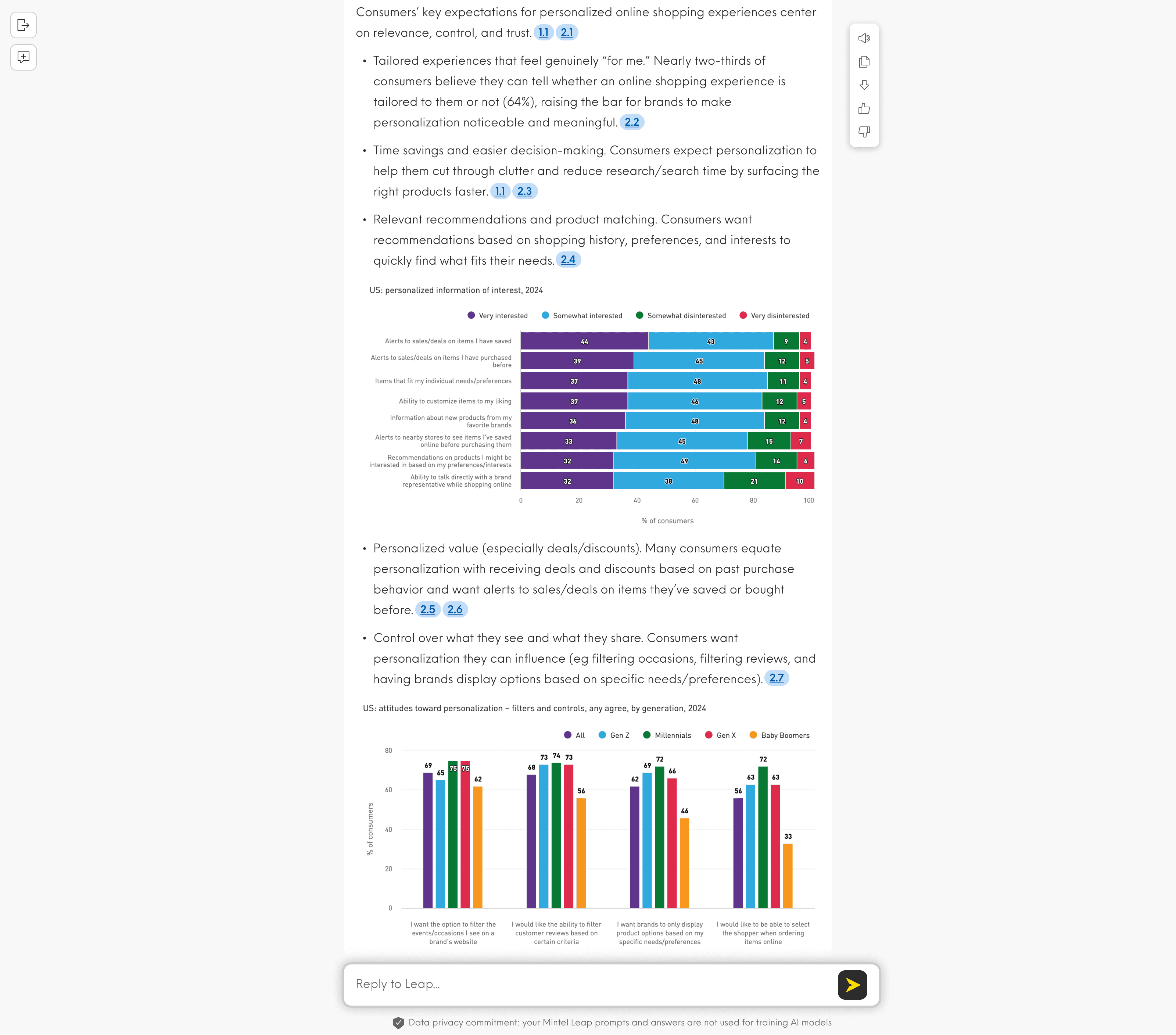
Inline charts within an answer, showing how it supports (not replaces) the narrative
Make answers feel trustworthy by showing where the evidence comes from
What we were solving:
For an AI answer to feel credible, users need to understand where the information came from especially when Leap is pulling in data-backed content like charts, category data, or other supporting sources. If that evidence isn’t visible or easy to follow, trust drops quickly. And when a question is better answered in another Mintel tool that Leap doesn’t yet surface directly, users still need a clear next step rather than hitting a dead end.
What I defined:
I defined a trust model for AI answers: clearly surfaced citations and source links to show where claims or data points come from. Where Leap couldn't yet feature a tool's underlying data directly, I introduced a top-of-answer routing pattern to guide users to the most relevant Mintel tool.
The impact:
This approach helped position Leap less like a chatbot and more like a research assistant that shows its working. Users could either validate what they were seeing through citations and sources, or be routed to the right destination when deeper product-specific exploration was needed. That balance supported both trust and continuity in the research journey.
Product routing prompts converted 27% of users to continue searching in Leap; helping users continue their research journey rather than stopping at a dead end.
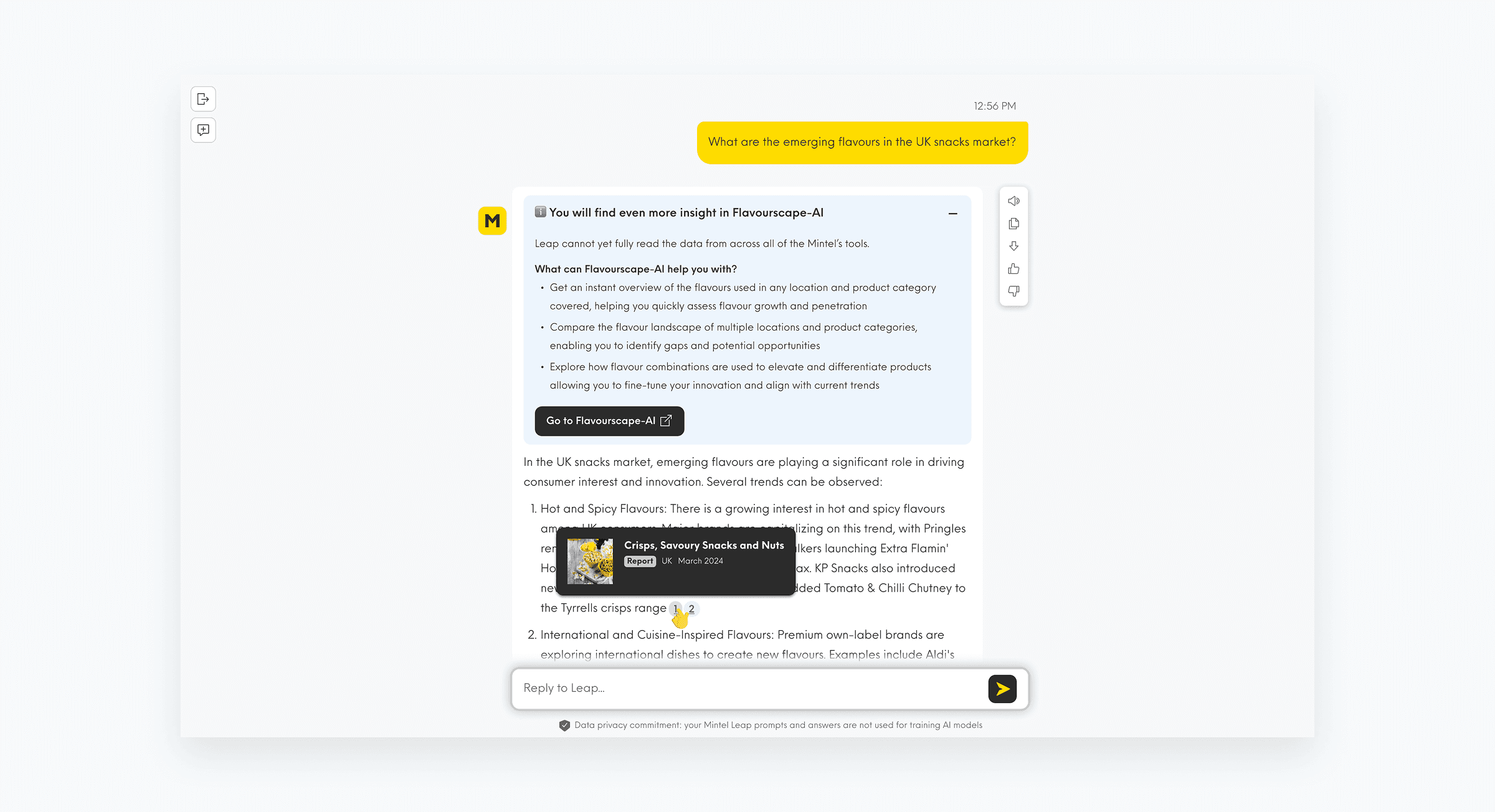
Product route banner at top of answer and cited supporting content within the response
Encouraging deeper exploration through suggested follow-up questions
The challenge:
Users often received a useful answer but weren't always sure what to ask next. This could bring sessions to an early end, limiting discovery and reducing opportunities to explore related information within the product.
What I defined:
I introduced context-aware follow-up questions that appeared alongside responses, helping users continue their research journey without having to formulate every prompt themselves. The suggestions were intended to reduce prompt friction, encourage adjacent lines of enquiry, and expose parts of the product users might otherwise miss.
The impact:
The feature reduced the cognitive effort required to continue a conversation, encouraged deeper exploration of topics, and helped keep users engaged within the product for longer. It created a more guided and conversational experience while still leaving users in control of where they wanted to go next.
Extend the answer experience with audio for accessibility and flexible working
What we were solving:
Some users may prefer, or need, to listen to longer answers rather than read them whether for accessibility reasons, multitasking, or reducing the effort of working through dense content.
What I defined:
An audio playback capability integrated into the existing action model, keeping the answer body focused on reading.
Implementation notes:
We iterated on edge cases in the action model (e.g., keeping feedback capture usable when actions move to the side, and aligning icon styling across the cluster).
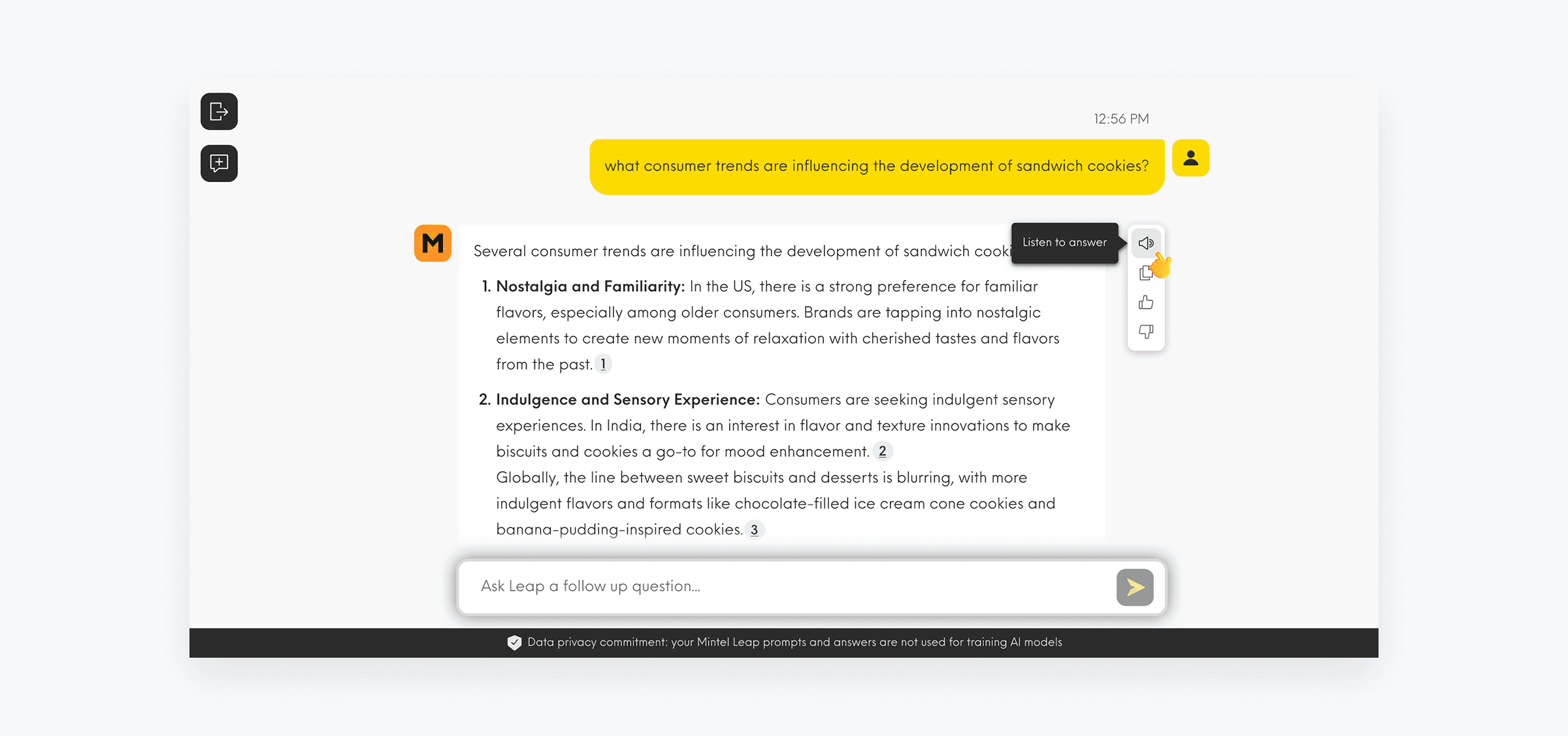
Audio playback control in the side action panel
What this enabled
Taken together, these decisions gave Leap a stronger foundation as the product grew more capable.
Homepage prompt guidance is used by approximately 1,600–2,400 unique users each month, turning the entry experience into a genuine onboarding mechanism rather than decorative UI. Answer exports reached 2,800 downloads per month soon after launch, signalling that users were taking outputs into docs, decks, and stakeholder comms. Product routing prompts converted 27% of users to continue searching in Leap when a question was better answered elsewhere.
Rather than treating every new capability as a separate experience, we established a flexible product framework; a readable answer area, transparent source handling, and clear actions for exporting, sharing, and continuing research. Leap is now used at meaningful enterprise scale: approximately 13,000 unique users per month and 40,000+ total unique searchers across the client base.
Reflection
This project reminded me that complexity doesn’t always need to be simplified away, it needs to be structured well. For AI-assisted products, trust is built through clear structure, predictable behaviour, and thoughtful disclosure of depth, so users can move quickly without losing confidence in what sits beneath the surface.