
Landscapes: Innovation trend analysis

Unifying fragmented analytics into one market overview that helps innovation teams spot what’s emerging, established, and likely to grow next.
ROLE
PROBLEM
Innovation teams struggled to understand what was emerging vs. established in a market. Insight required switching between separate tools and mentally stitching data together; slowing decisions and weakening confidence in the analysis.
OUTCOME
• Unified three separate analytics experiences into one product, reducing friction and supporting faster cross-attribute exploration.
• Established an overview → drill-down → forecast model where 72% of users click through from the landscape chart to attribute details.
• Created a scalable product structure that reached 6,400+ users and 25,000+ sessions within months of launch.
Overview
Mintel builds products that help companies make better decisions about innovation and growth.
This project demonstrates my ability to bring clarity to complex, data-heavy products; shaping an experience that helps users interpret sophisticated analytics quickly and confidently.
The core value isn’t the number of features, it’s the speed at which users can understand a market and move from overview to evidence. The landscape chart acts as that starting point: a snapshot that helps users separate signal from noise and then drill into forecasting and supporting detail when needed.
The problem
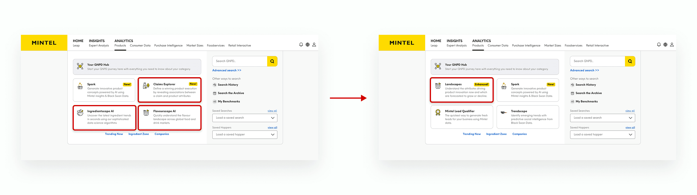
Before this work, three major analytics experiences lived as separate tools, one focused on flavours, one on ingredients and one focused on claims. That split created friction: users had to decide where to start, learn different patterns, and mentally connect insights across tools.

The product direction was to unify those experiences into a single tool, expand it to cover additional lenses (claims and formats/textures), and add forecasting so the tool supports forward-looking decisions rather than only hindsight.
This created a classic design challenge: how do you add breadth (more views, more audiences) without increasing cognitive load? In analytics, if the experience feels heavy or inconsistent, trust drops quickly.
There were also practical constraints that shaped UX decisions. For example, some navigation elements were controlled by a shared platform framework rather than the product itself, limiting what could be moved within the app.
My role and collaboration
I led product design for the unified Mintel Landscapes experience; shaping navigation, information hierarchy, and reusable patterns across multiple analytical lenses.
I worked closely with product and engineering throughout, especially where product ambition needed to be balanced against feasibility and performance (e.g. forecasting at scale) and platform constraints.
Rather than a one-time handoff, I partnered through refinements; identifying issues most likely to erode trust (readability at scale, unclear hierarchy, tooltip behaviour, contrast) and turning them into implementable improvements.
Key design decisions
Our goals included:
Making the chart instantly readable: users should understand what they’re looking at within seconds.
Clarity over density: The first screen should be scannable and teach the pattern quickly, pushing complexity into the drill-down.
Stable context: Switching views or filters shouldn’t feel like starting again.
Progressive disclosure: Deeper detail (definitions, forecasting, examples) should appear when users ask for it.
Scalable patterns: Design for additional views and future evolution without one-off solutions.
Making the landscape chart the front door
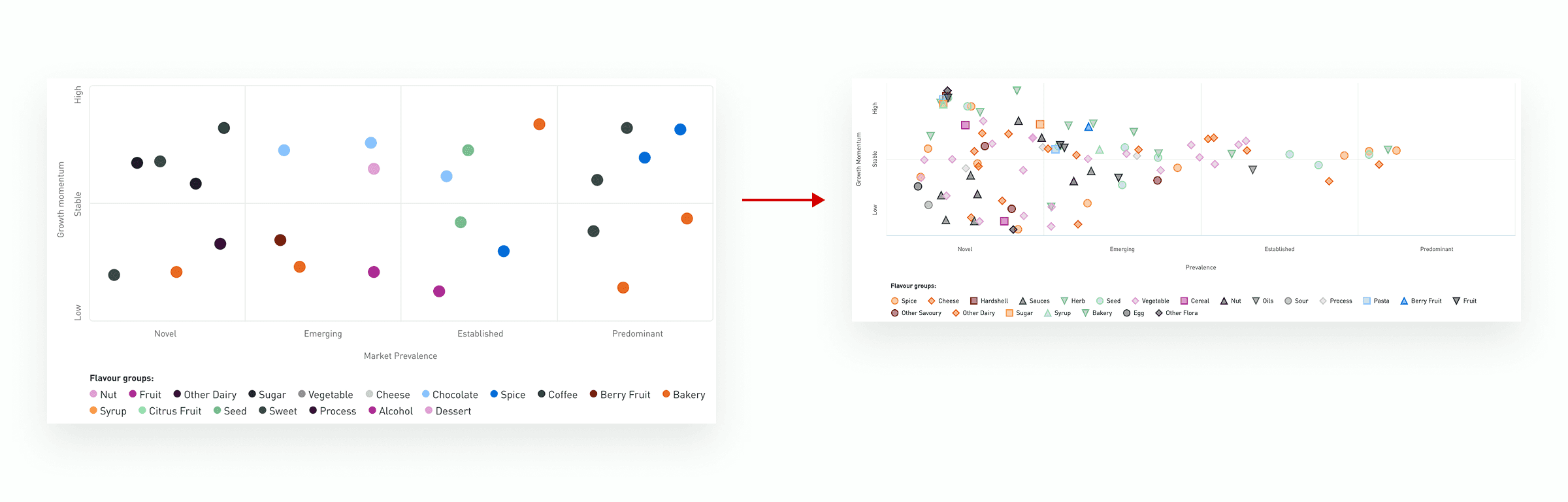
As a product team we chose a scatterplot for the landscape overview because the core job of the tool is to show two signals at once; how established an attribute is (Prevalence) and whether it’s accelerating or declining (Growth Momentum). Plotting Prevalence on the x axis and Growth Momentum on the y axis lets users interpret the market in a single glance; niche vs dominant, rising vs falling, before deciding where to drill in.
In dense markets, many attributes can share similar values, which causes points to overlap and reduces the chart’s usefulness. To preserve readability at scale, I defined a visual treatment that used reduced point opacity to reveal overlapping clusters, paired with subtle positional jitter to separate coincident points without distorting the underlying data story. Where lowering opacity risked weakening visibility, I reinforced the points with a subtle stroke so they remained legible while still reducing visual noise.
Finally, we intentionally kept the scatterplot format consistent while improving the underlying methodology and the supporting experience around it. This avoided retraining users on a new chart type, preserved the familiar “market snapshot” mental model, and allowed us to focus change where it added most value (interpretation, drill down, forecasting).
Unifying separate tools into one coherent experience
I defined a single product entry point with internal navigation between lenses, instead of making users jump between separate tools.
This reduced the “where do I go?” anxiety and encouraged cross-attribute exploration, which is where the insight value lives.
Balancing guidance for first-time users with continuity for returning ones
A key product decision was to balance guidance for first-time users with continuity for returning ones.
On first use, the experience adapts to the user by pre-selecting filters based on their industry, giving them a relevant starting point without requiring upfront setup. From there, the system remembers their most recent view and filter context, so future visits feel continuous rather than reset.
The intent was to reduce early friction while building familiarity over time. For first-time users, a guided starting point removes decision load. For returning users, restoring their previous state helps them pick up where they left off making the product feel intuitive and reliable from the first few seconds.
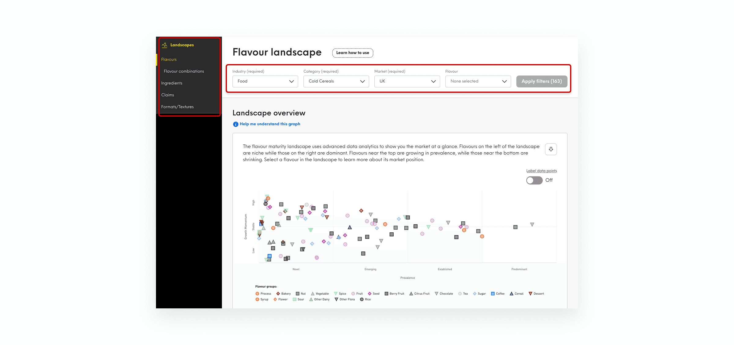
A guided starting point for new users, with state persistence for returning users.
Filters as the anchor for context and exploration
The broader goal was a unified experience that lets users switch between lenses seamlessly, rather than treating each view like a separate product.
I anchored the experience around a stable, prominent filter area so the user's context (category/market) was preserved while switching lenses.
This helped users think “what market and category am I exploring?” first. Keeping that stable makes exploration feel fast and reversible.
Overview → drill-down → forecast: progressive disclosure of complexity
Landscapes and forecasts are designed to work together. The chart helps users identify what matters, forecasts help validate whether a trend looks sustainable or short-lived.
This is why the information hierarchy matters. The overview should remain scannable, while forecasting and supporting detail appear in drill-down, only after users have signalled intent by selecting an attribute.
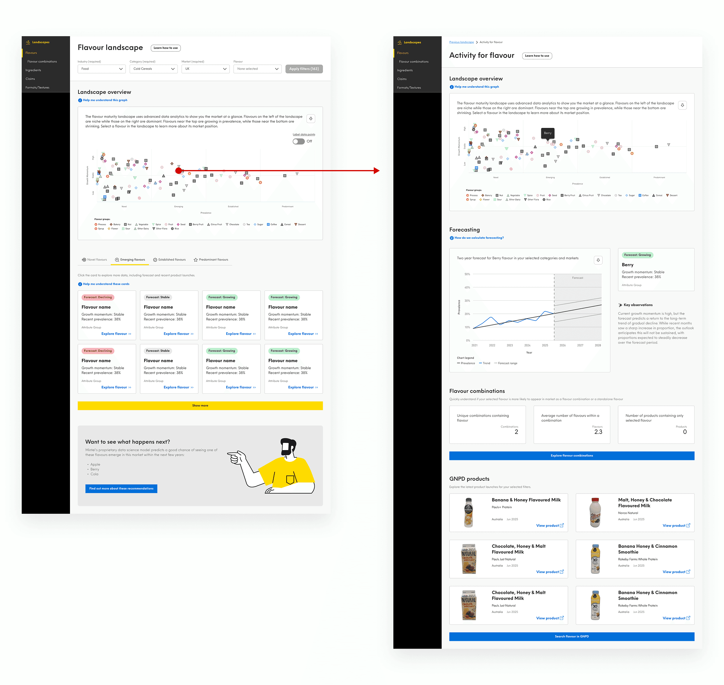
Progressive disclosure: overview first, then forecasting depth on selection
Where it landed
Taken together, unification removed invisible friction, and the data suggests users are reading the market overview, not skipping it.
Since launching in October 2025, Landscapes has reached 6,400+ unique users across 25,000+ sessions, averaging ~4 sessions per user. 65% of sessions include a search, and nearly all of those users go on to engage with the analysis; validating the overview → evidence model.
72% of users click through from the landscape chart to attribute details, with 38,000+ chart interactions including legend exploration and zoom. Weekly active users grew from ~700 to nearly 1,000 within months of launch, while early client feedback described teams “absolutely loving” the new ways to work with the data.
Learnings / reflection
Unification is mostly about removing invisible friction: Clear defaults, stable anchors, and predictable navigation make complex analytics feel approachable.
In data products, trust is built through small details: Tooltip behaviour, grid discipline, and contrast aren’t polish, they’re part of the product’s credibility.
New capabilities only work when the hierarchy is deliberate. A strong overview → drill-down structure prevented forecasting and added lenses from turning into noise as scope expanded.